Increasing conversion to secure data integrity
Design lead | 6 month project | Team of 11
Key results
Apple “Best New App”
260% download increase
2x conversion (linked inboxes)
Launch of Slice Intelligence
Conversion rates were plateauing. Without an increase in the number of inboxes linked to Slice, the Slice Intelligence B2B market research data would not be statistically significant enough to launch. Our goal was to double the number of linked inboxes to secure data integrity.
Context & challenge
In January 2014, the Slice Consumer Products team was tasked with doubling the number of users with a linked inbox to strengthen the data integrity of its sister product, Slice Intelligence. The team redesigned the flagship iOS application to better attract, adopt and retain users as a means to increase the volume of purchase data from online shoppers.
Background
Slice was a consumer-based mobile and web application which enabled online shoppers to organize, track, and save money on their online purchases. Purchase information collected through Slice was used to power Slice Intelligence (now Rakuten Intelligence), a B2B market research tool offering insights into online consumer trends, retailers, brands and logistics companies.
Context
After being live three years, app conversion rates had begun to plateau. Issues with trust, discoverability, user satisfaction, and market competition were contributing factors.
In order to ensure the statistical significance of the Slice Intelligence data, we needed to dramatically increase the number of email inboxes linked to Slice.
Challenge
Our goal was to double the number of users with a linked inbox to secure the data integrity of the Slice Intelligence market research data.
My role + responsibilities
I led strategy and interaction design, while directing the work of two visual designers and one UXR intern.
Foundational research
To better understand users’ waning satisfaction with the tool and how they were using the app we conducted both qualitative and quantitative research. I mentored a UXR intern in recruiting, conducting, and summarizing the research.
We started by running a qualitative survey with frequent users of the app to recruit interview participants and help focus the content of our one-on-one interviews.
Simultaneously, we pulled analytics data from the same group to understand patterns of use and shopping habits.
Lastly, we conducted 1-1 interviews with 30 customers to learn more about what motivated them to download Slice, what they liked and disliked about it, and what they’d want to see improved.
What users said
Key learnings
Learning 1
Users wanted a seamless app that perfectly performed one function: package tracking
Learning 2
Participants perceived Slice primarily as a shipping app - not a shopping app
Learning 3
Users were frustrated when the status of a package would change and Slice missed it
Learning 4
Customers valued the automatic email sync and immediate personalization of the app
Connecting the team to our research
From the research, we created lightweight personas to help guide the ideation process and invited team members to participate in a design workshop. The session helped build empathy as we worked on establishing design principles.
Design principles workshop
We spent a day immersing team members from Product, Engineering and Marketing in user personas and research, as well as brainstorming experience qualities we wanted the app to embody.
The team collectively defined our user-centered design principles from the workshop, which became to make package tracking:
Seamless
Simple
Trustworthy (for new users in particular)
Celebratory
Redesign goals
Re-elevating package tracking
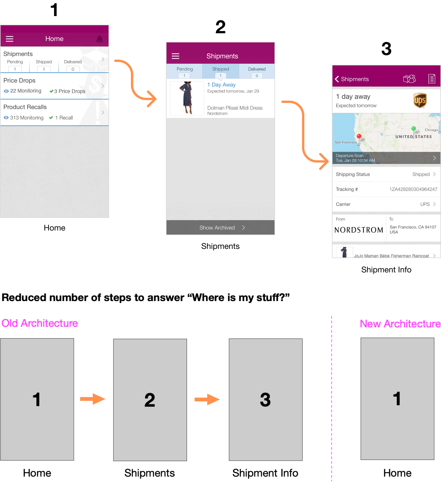
One of our primary objectives was to surface the latest package tracking information to users immediately upon opening the app.
Collapsing the hierarchy
This meant merging content from three different screens within the existing app. It also meant finding a place to display Price Drops and Product Recalls, when they occurred.
Moving to a feed interaction model
To handle the constantly changing nature of package tracking updates, I explored feed UI patterns to collapse the hierarchy and get users to the information they wanted, faster.
We chose the Event activity feed approach for two reasons:
Past research showed that users viewed purchases as orders. Splitting an order up on the app into individual items might confuse them.
The Event activity feed was also great for being able to serve up different types of cards when appropriate, such as when a price drop or recall occurred.
Approach #1: Item-centric feed
Approach #2: Event activity feed
The feed structure also offered flexibility in displaying order details and shipping details within the same card. Users could first see what was coming and then swipe to view where it was or tap to navigate to the shipment detail page.
Establishing trust
Our current on-boarding flow was failing to convert, not only within the app, but across our entire marketing channel. We knew trust was our biggest acquisition challenge. Not everyone was keen on granting access to their inbox for the parsing of email receipts.
Users wanted to know:
How will my personal emails be kept safe?
What other emails could they be reading/parsing that are in my inbox?
Will it delete my emails?
Our hypothesis: we could build trust and increase conversions through improved product branding, messaging and on-boarding
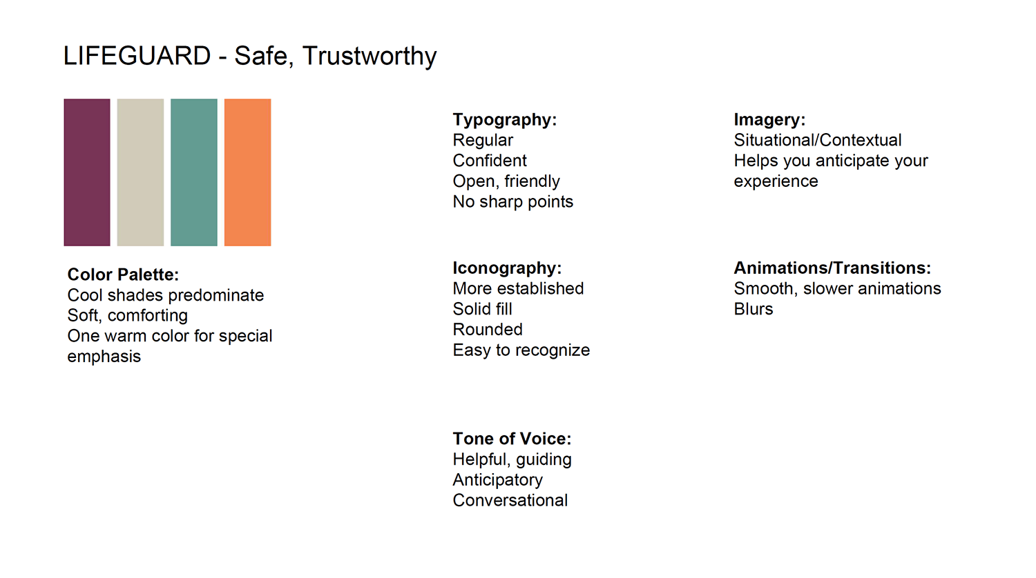
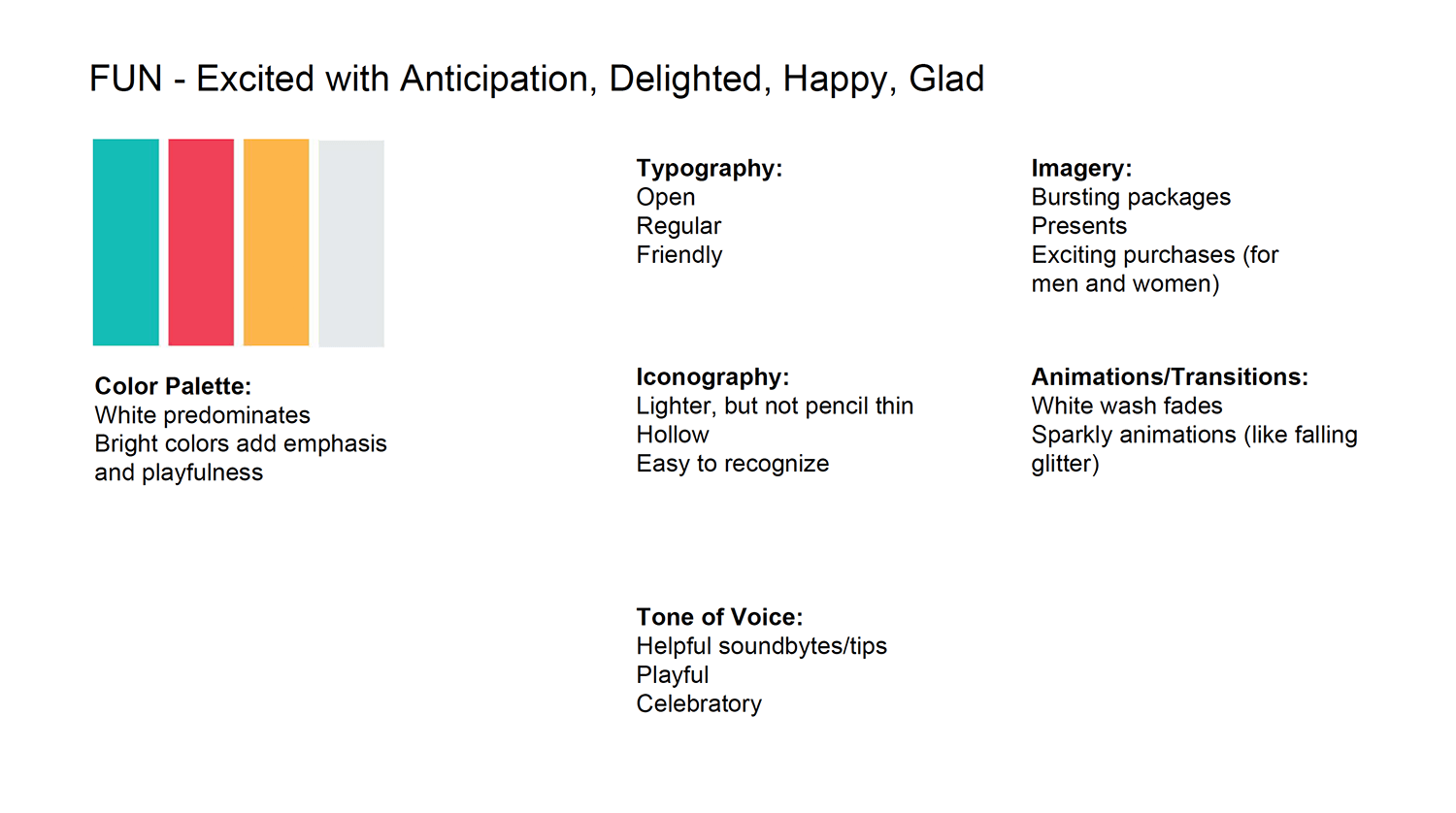
Leveraging results from the team brainstorming workshop, I directed the visual designers to tackle the creation of different color palettes and visual styles.
We chose to move forward with the a brand identity centered around “Celebrating What’s Coming.”
Empowering users
Knowing there were situations where our technology would not be able to connect all the dots for users, we introduced contextual management tools to help users better control their experience.
Problem
In previous versions, users didn’t have tools on the list page to make status changes when things went wrong. They either had to delete the entire purchase or leave it as is.
Solution
Directly from the Home, users could tap on a card to take action.
We also added the ability to “Pin” an order to the top of the feed. This helped customers keep imporatnt orders front and center, like “Pending” and removed pressure from the engineering team to capture each transition from pending to shipped with 100% accuracy.
Build excitement
To clarify and celebrate what was on the way within the app, we experimented with a gallery concept within a feed card - which would help users understand what was inside a package in a single glance and hopefully build more excitement around its arrival.
Usability testing
To uncover unknown usability issues across the app and make updates prior to launch, we ran two different studies with prospective and existing users.
With prospective users, we ran remotely moderated usability tests through usertesting.com and used Tomer Sharon’s “Rainbow Spreadsheet” to document common issues across participants.
With existing users, we recruited them to download a beta version of the app via TestFlight and asked them to report on their experience over one week via Instabug.


